Medical Hospital Color Schemes play a crucial role in patient well-being and staff productivity. Choosing the right palette goes beyond mere aesthetics; it’s a science that impacts healing, reduces stress, and fosters a positive environment. From calming blues to energizing greens, the psychology of color is intricately woven into the fabric of healthcare design. Let’s delve into the world of medical hospital color schemes and uncover the secrets to creating a therapeutic and uplifting space.
Understanding the Psychology of Color in Healthcare
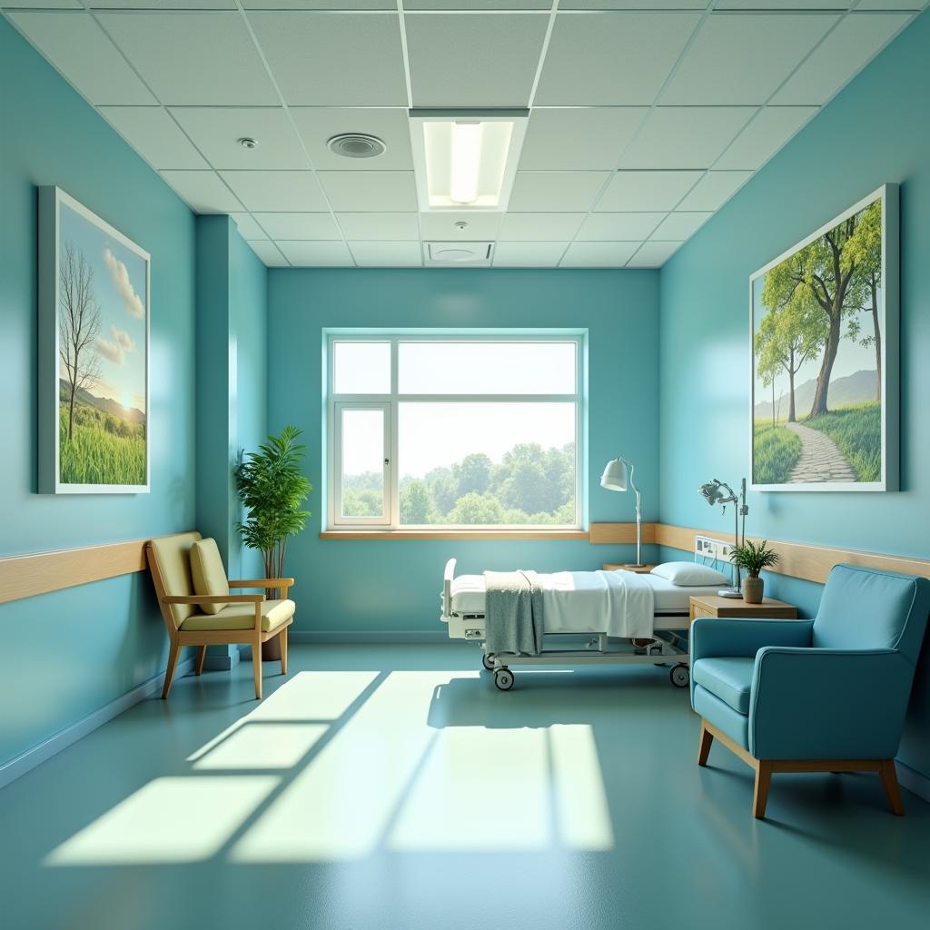
Colors evoke powerful emotional and psychological responses. In a healthcare setting, this impact is amplified, influencing patient mood, recovery, and even perceived pain levels. A well-chosen color scheme can create a sense of tranquility, reduce anxiety, and promote a sense of well-being. For instance, cool blues and greens are often associated with calmness and serenity, while warmer tones like yellows and oranges can stimulate activity and optimism.  Calming Hospital Room Colors
Creating a Healing Environment with Strategic Color Choices
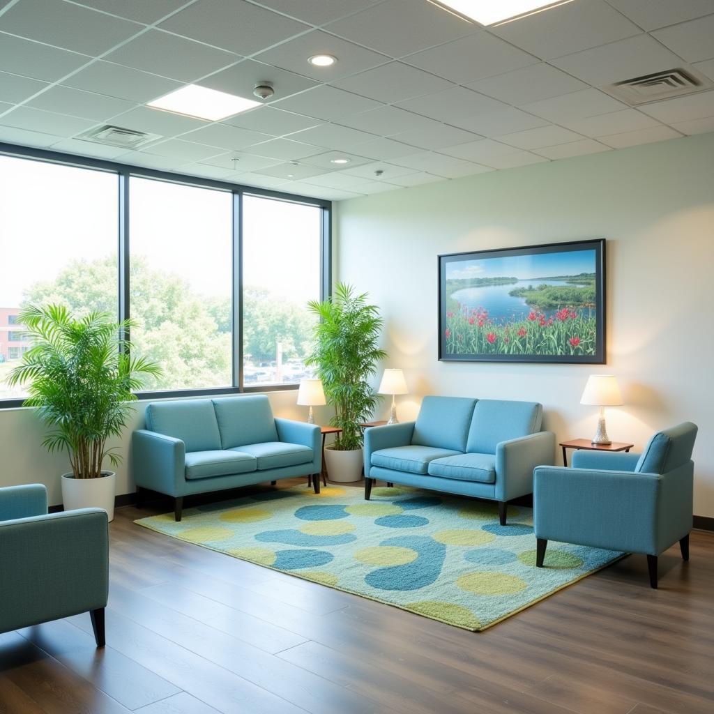
The goal of medical hospital color schemes is to create a healing environment that supports both patients and staff. Using colors strategically can transform a sterile space into a comforting and supportive one. Consider the specific needs of each area within the hospital. For example, waiting areas may benefit from calming blues and greens to reduce anxiety, while operating rooms might utilize cooler colors to minimize eye strain for surgeons. In patient rooms, soft, neutral tones can create a sense of peace and promote relaxation, while brighter accents can add a touch of cheerfulness. Hospital door hangers can also be designed with color psychology in mind to further enhance the patient experience.
Best Practices for Medical Hospital Color Schemes
When selecting colors for a medical facility, certain best practices should be followed. Avoid overwhelming or stimulating colors in areas where patients are recovering or experiencing high stress. Consider incorporating natural elements and artwork to complement the color palette. Furthermore, lighting plays a crucial role in how colors are perceived. Natural light is ideal, but in areas where it’s limited, ensure that artificial lighting complements the chosen colors and doesn’t create a harsh or sterile feel. Choosing the right hospital shirt designs can also contribute to a positive and professional atmosphere.
“Color is a powerful tool that can significantly impact the patient experience,” says Dr. Anya Sharma, a leading expert in environmental psychology. “By carefully considering the psychological effects of color, we can create spaces that promote healing and well-being.”
Color Schemes for Different Hospital Areas
Different areas within a hospital have unique needs and functions, requiring tailored color schemes. High-traffic areas like corridors and reception areas can benefit from brighter, more stimulating colors. Patient rooms should prioritize calmness and relaxation, while operating rooms and treatment areas need to be functional and minimize distractions.  Hospital Waiting Area Color Scheme
Balancing Aesthetics and Functionality
While aesthetics are important, functionality should be the primary driver when choosing medical hospital color schemes. Colors should be easy to clean and maintain, and they should not create glare or visual distractions. Wayfinding is another critical consideration. Using contrasting colors for walls and signage can improve navigation and reduce confusion, particularly for patients and visitors who may be unfamiliar with the hospital layout. Think about how hospital room signs can be integrated seamlessly with the overall color scheme.
“A successful hospital color scheme balances aesthetics with practicality,” adds Dr. Sharma. “It’s about creating a space that is both visually appealing and conducive to healing.”
The Future of Color in Healthcare Design
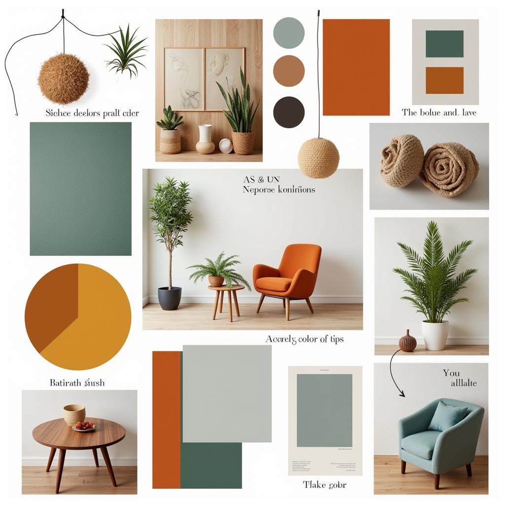
The use of color in healthcare design is constantly evolving. New research on the psychological effects of color continues to inform best practices. The incorporation of biophilic design, which emphasizes connecting people with nature, is also influencing color choices, with a growing trend towards incorporating natural hues and textures. Door signs for hospital are also evolving to incorporate these principles.
 Modern Hospital Color Palette
In conclusion, medical hospital color schemes are a vital element of healthcare design. By understanding the psychology of color and implementing strategic color choices, hospitals can create healing environments that support patients, staff, and visitors alike. Choosing the right palette is an investment in patient well-being and contributes to a positive and uplifting healthcare experience. Don’t overlook the importance of a thoughtfully designed color scheme when creating a healing and welcoming hospital environment.
FAQ
- What are the best colors for a hospital waiting room?
- How can color affect patient recovery?
- What are the key considerations when choosing colors for a hospital?
- What is biophilic design and how does it relate to hospital color schemes?
- What are some common mistakes to avoid when choosing hospital colors?
- How can color improve wayfinding in a hospital?
- What are the latest trends in hospital color schemes?
Need assistance with your healthcare design project? Contact us at Phone Number: 02437655121, Email: [email protected], or visit us at 298 Cau Dien Street, Minh Khai, Bac Tu Liem, Hanoi, Vietnam. Our 24/7 customer support team is here to help. You can also check out our buffalo general hospital floor directory for more information.