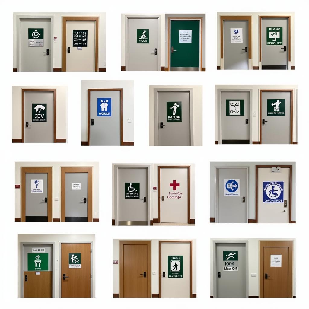
Hospital Door Signs are much more than simple labels; they are critical navigational tools that contribute to the efficiency, safety, and overall experience within a healthcare facility. Effective hospital door signs provide clear and concise information that helps staff, patients, and visitors navigate the often-complex layout of a hospital.
 Hospital Door Sign Examples
The Importance of Clear and Concise Signage
Imagine yourself in a hospital, perhaps feeling anxious or disoriented. You need to find a specific doctor’s office or the laboratory, but the signage is confusing or unclear. This scenario highlights the importance of well-designed hospital door signs. They play a crucial role in:
- Wayfinding: Clear signage helps individuals quickly and easily locate their desired destination within the hospital, reducing stress and anxiety for patients and visitors.
- Safety: Hospital door signs identify critical areas such as fire exits, emergency rooms, and restricted access zones, ensuring the safety and security of everyone within the facility.
- Efficiency: When staff, patients, and visitors can easily navigate the hospital, it streamlines operations and reduces wait times.
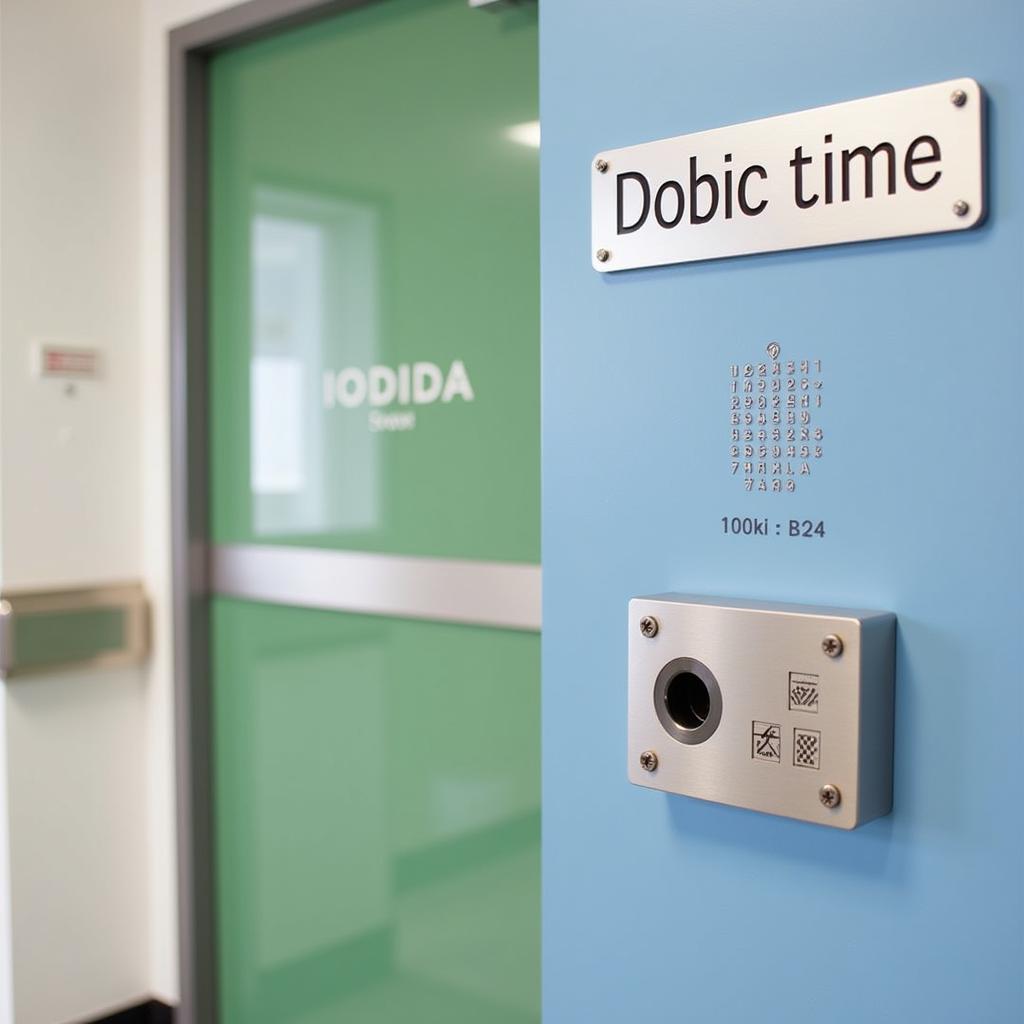
- Accessibility: Signs incorporating braille and tactile elements ensure that individuals with visual impairments can navigate the hospital independently.
Essential Elements of Effective Hospital Door Signs
 ADA Compliant Hospital Door Sign
To achieve these goals, hospital door signs should incorporate the following essential elements:
- ADA Compliance: All signs must adhere to the Americans with Disabilities Act (ADA) guidelines, ensuring accessibility for individuals with disabilities. This includes using specific fonts, sizes, colors, and tactile elements.
- Clear and Concise Language: Use simple, easy-to-understand language that is universally recognized. Avoid medical jargon or technical terms that might confuse patients or visitors.
- High Contrast Colors: Employ a high contrast color scheme between the text and background to ensure readability. This is particularly important for individuals with low vision.
- Appropriate Font Size and Style: Choose a clear and legible font. The font size should be large enough to be read from a distance, considering the viewing angle and distance.
- Logical Placement: Strategically place signs in highly visible locations to facilitate easy navigation. Consider traffic flow and potential obstructions.
- Durable Materials: Use materials that are durable and can withstand frequent cleaning and sanitizing. Hospitals are high-traffic environments, so signs must be able to handle wear and tear.
Beyond the Basics: Enhancing Hospital Door Signs
In addition to the essential elements, hospitals can enhance their door signs further by:
- Incorporating Visual Cues: Use symbols, icons, and pictograms to supplement text, making the information easier to process, especially for those who speak different languages.
- Implementing a Consistent Design System: Maintain a consistent design language for all signs throughout the hospital, ensuring a cohesive and professional look.
- Utilizing Technology: Consider incorporating digital displays for dynamic messaging, wayfinding kiosks, and interactive maps to further enhance the patient experience.
Hospital Door Signs: A Small Detail with a Big Impact
Hospital door signs, though seemingly small details, play a significant role in shaping the overall experience within a healthcare facility. By prioritizing clear, accessible, and well-designed signage, hospitals can improve patient satisfaction, staff efficiency, and overall safety. As you consider the needs of your hospital, remember that effective signage is an investment in the well-being of your patients, staff, and visitors.
Frequently Asked Questions about Hospital Door Signs
What are the ADA requirements for hospital door signs?
ADA requirements cover font styles, sizes, colors, contrast, tactile lettering, and braille.
What materials are best for hospital door signs?
Durable materials like acrylic, engraved plastic, and aluminum are commonly used for their longevity and ease of cleaning.
Can digital displays be used for hospital door signs?
Yes, digital displays offer flexibility for dynamic messaging, wayfinding, and room scheduling.
How often should hospital door signs be updated?
Regular updates are crucial to reflect any changes in room numbers, departments, or staff information.
Where can I find resources for designing compliant hospital door signs?
The ADA website and specialized signage companies provide valuable resources and guidance.
Need help with hospital beds? Consider these resources:
For insights into the healthcare industry:
- Southeast Hospital Cape Girardeau Mo Jobs
- Middlesex Veterinary Hospital & House Calls Veterinary Service
- Consider the Hospital Emergency Room Data
Contact us at Phone Number: 02437655121, Email: [email protected] or visit us at 298 Cau Dien Street, Minh Khai, Bac Tu Liem, Hanoi, Vietnam. Our dedicated customer support team is available 24/7 to assist you.