Hospital Wayfinding Signage is a critical aspect of the patient experience, helping visitors navigate complex hospital layouts and reducing anxiety in unfamiliar environments. Effective hospital wayfinding solutions go beyond simple directional signs; they encompass a comprehensive strategy that considers the needs of all users, from patients and visitors to staff members.
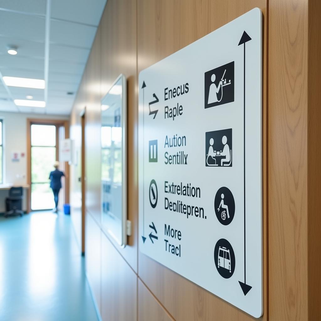
 Hospital wayfinding signage example
The Importance of Effective Hospital Wayfinding Signage
Navigating a hospital can be a stressful experience, especially for first-time visitors, patients feeling unwell, or those with mobility issues. Clear and consistent wayfinding signage plays a vital role in alleviating stress and enhancing the overall patient experience. By providing clear directions and intuitive navigation, hospitals can:
- Reduce patient anxiety: Clear signage reduces confusion and frustration, making patients feel more at ease and in control.
- Improve patient flow: Effective wayfinding minimizes bottlenecks and congestion by guiding visitors efficiently to their destinations.
- Enhance staff efficiency: Clear signage reduces the time staff spends providing directions, allowing them to focus on patient care.
- Strengthen brand image: Well-designed signage contributes to a positive impression of the hospital’s professionalism and commitment to patient well-being.
Key Elements of Successful Hospital Wayfinding Signage
Creating a successful hospital wayfinding system requires careful planning and attention to detail. Here are some key elements to consider:
1. User-Centered Design
Effective signage prioritizes the needs of its users. This means considering factors like:
- Readability: Signage should employ clear fonts, high-contrast color schemes, and appropriate font sizes for easy readability from a distance.
- Language Accessibility: Using multiple languages and Braille ensures inclusivity for diverse populations.
- Logical Placement: Signs should be strategically located at decision points, providing clear guidance when and where it is needed most.
2. Consistency and Clarity
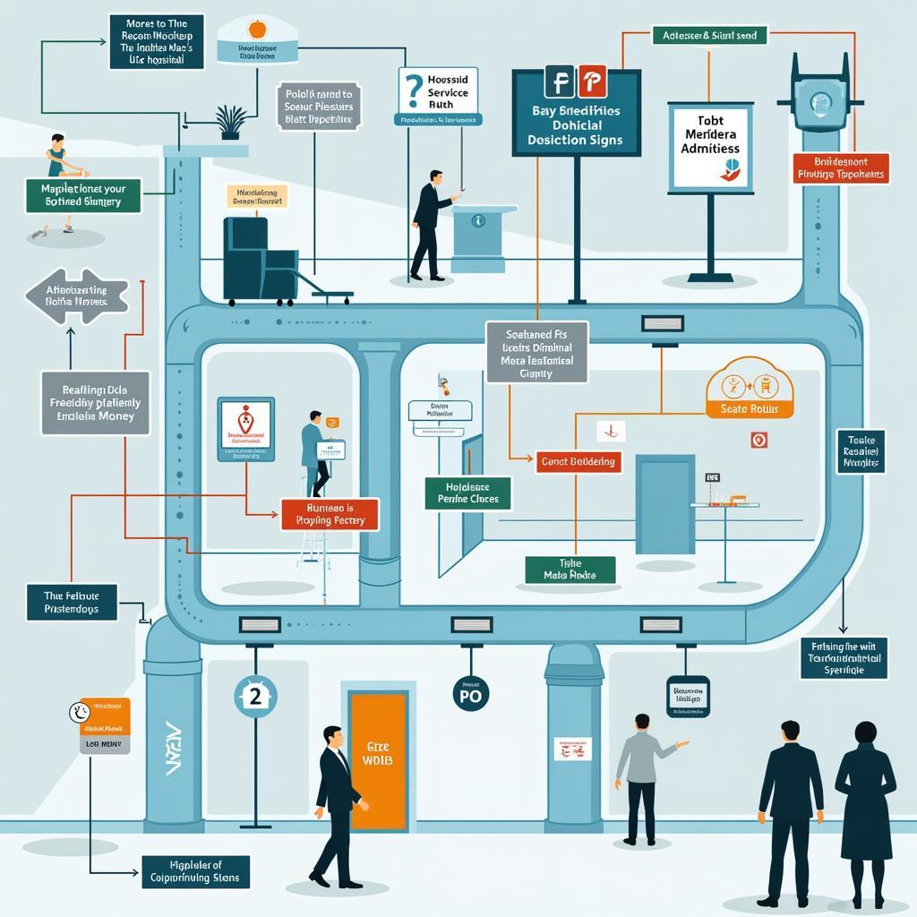
Maintaining consistency in design elements such as color coding, typography, and terminology throughout the hospital is crucial for easy navigation.
- Color Coding: Assign specific colors to different departments or areas to create visual cues for easier navigation.
- Standardized Terminology: Using consistent language across all signage prevents confusion and reinforces directions.
 A comprehensive hospital wayfinding signage system
3. Integration of Technology
Modern hospital wayfinding systems can leverage technology to further enhance the user experience:
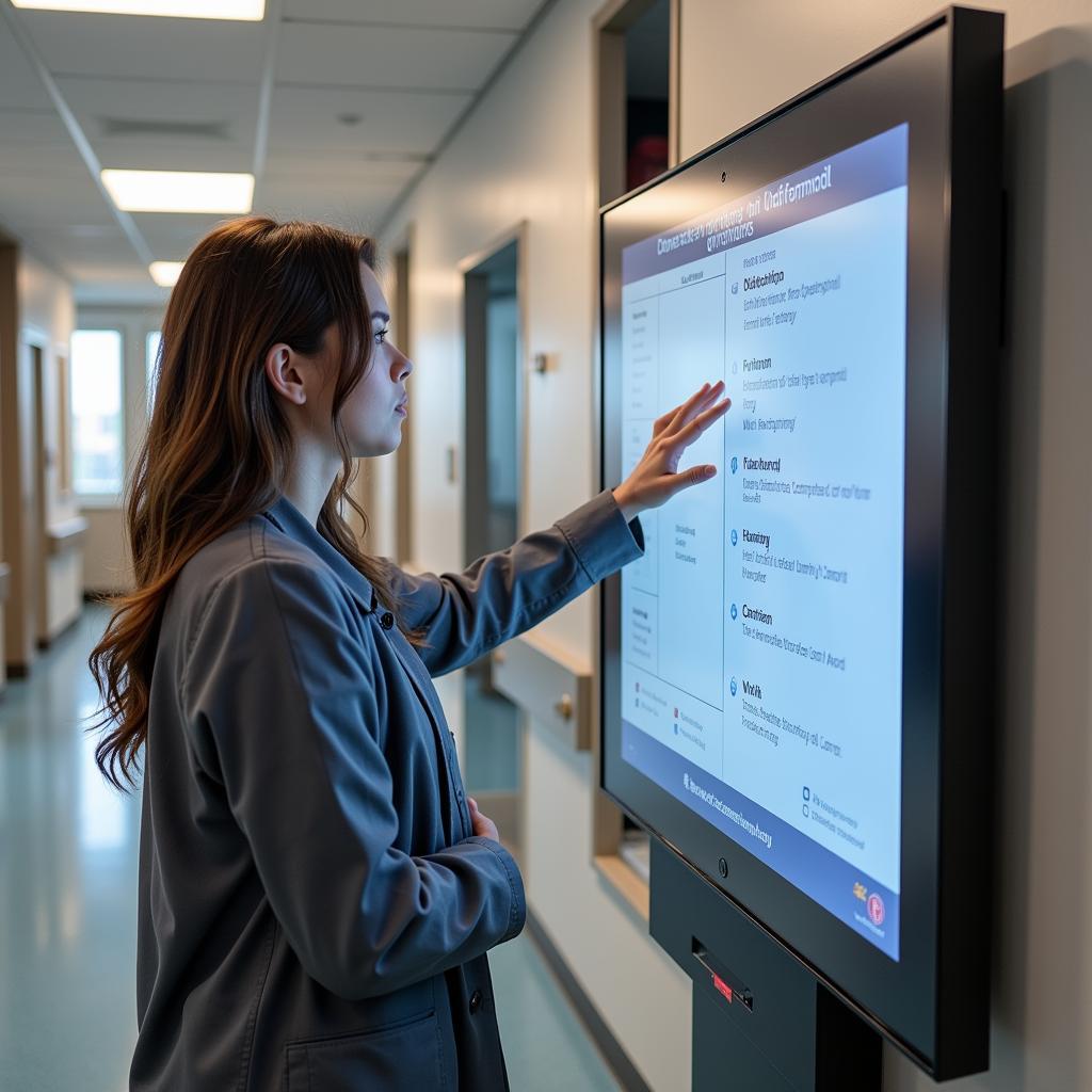
- Digital Directories: Interactive kiosks provide real-time information, wayfinding assistance, and can display wait times for different services.
- Mobile Applications: Hospital apps can offer personalized wayfinding, indoor navigation, and even appointment reminders.
Optimizing Hospital Wayfinding Signage for Different User Groups
While a cohesive signage system is essential, it’s also important to consider the specific needs of different user groups:
- Patients: Use clear and simple language, larger font sizes, and consider incorporating visual aids like icons or symbols.
- Visitors: Provide clear directions to waiting areas, restrooms, and amenities like cafeterias or gift shops.
- Staff: Ensure staff areas are clearly marked, and consider signage that facilitates internal communication and logistics.
Map of Sinai Hospital Baltimore and Other Best Practices
Leading hospitals prioritize wayfinding as a core element of the patient experience. Take inspiration from successful implementations like the map of St. Joseph Hospital or consider seeking professional hospital wayfinding solutions for customized design and implementation.
By incorporating these best practices, hospitals can create wayfinding systems that effectively guide patients, visitors, and staff, ultimately contributing to a more positive and stress-free healthcare experience.
 A digital hospital wayfinding kiosk in use
Conclusion
Hospital wayfinding signage is an investment in patient satisfaction, staff efficiency, and a positive brand image. By implementing a well-designed and user-friendly wayfinding system, hospitals can significantly improve the overall experience for everyone who walks through their doors. Remember, clear signage is more than just directions; it’s about providing reassurance, reducing anxiety, and creating a welcoming environment for all.
FAQ
1. What are the benefits of digital wayfinding signage in hospitals?
Digital signage offers flexibility for updates, real-time information display, and can incorporate interactive features for enhanced user engagement.
2. How can I make hospital wayfinding signage accessible for visually impaired individuals?
Use Braille, tactile lettering, and high-contrast color combinations to ensure signage is accessible to those with visual impairments.
3. What is the ideal font size for hospital wayfinding signage?
Larger font sizes, typically 24 points or higher, are recommended for improved readability from a distance.
4. Map of St Peter’s Hospital – How can I learn more about effective wayfinding strategies employed by other hospitals?
Researching case studies and best practices from other healthcare facilities can provide valuable insights and inspiration for your own wayfinding project.
5. What is the role of technology in modern hospital wayfinding solutions?
Technology like mobile apps, interactive kiosks, and digital signage enhances wayfinding by providing real-time information, personalized routes, and improved accessibility.
Still need help? Contact us at Phone Number: 02437655121, Email: [email protected] or visit us at: No. 298 Cau Dien Street, Minh Khai, Bac Tu Liem, Hanoi, Vietnam. Our customer service team is available 24/7.